
Designing a "Business Card" website
Designing a "Business Card" website
How to you choose?

Time!
I’ve been so busy with photography stuff, that I haven’t had time to post about the business card website assignment for PE.
This week I finally had enough time! I got to work on my first business card website. I say “first” because I see this one as a first try! I am happy with these first results! I was able to create a plan + stick to it!!! That is sort of a big deal for me.
I learned a lot from this process. At first I was trying to approach this project like I always do - fast and loose! Except this time that sent me spinning out of control and into a dark zone where I had a hard time making final decisions!
Fonts
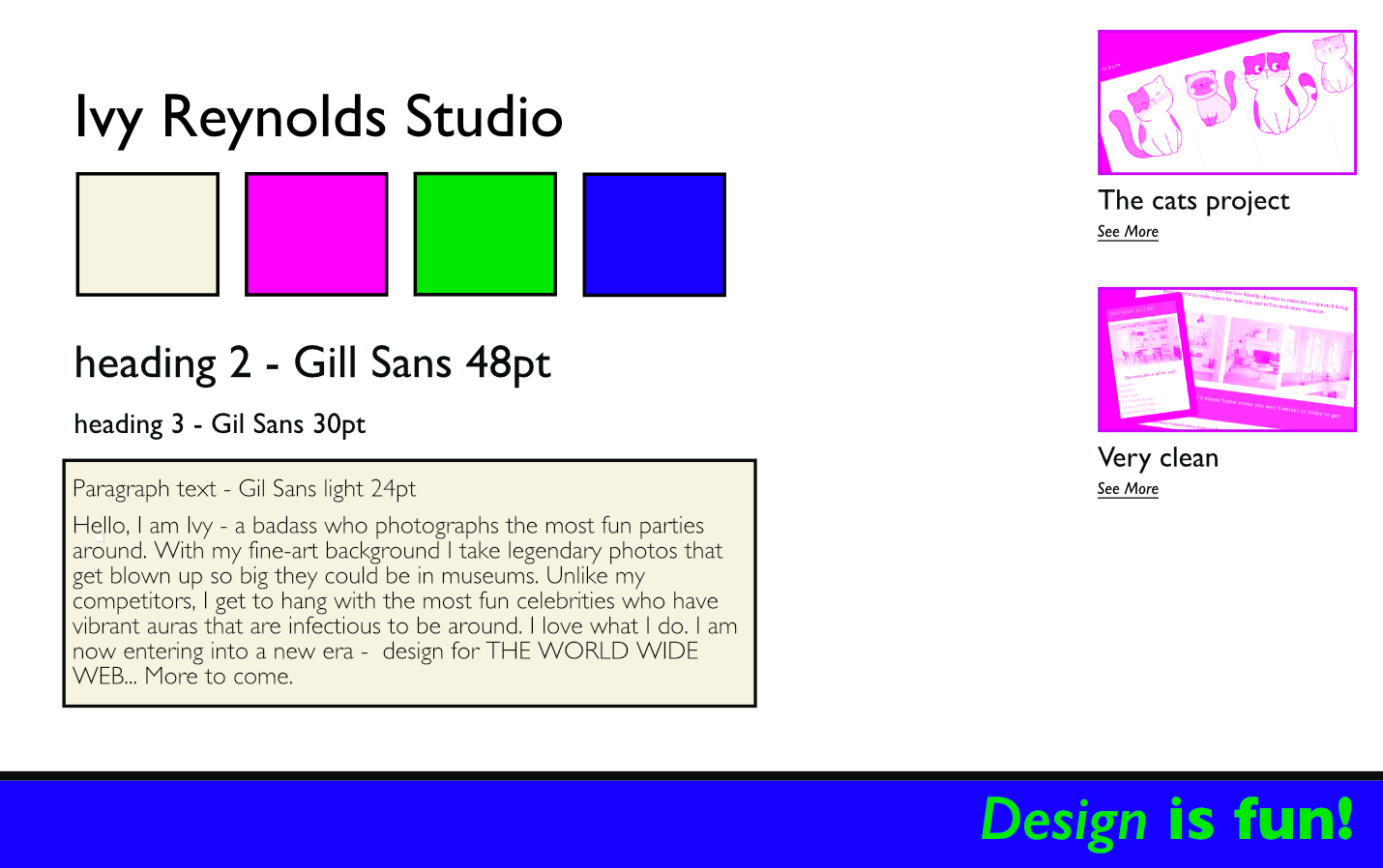
The words to describe what I was going for were BOLD, EDGY, and OPINIONATED. I wanted to appear (upon first glance) as not afraid of color, fresh, clean, and strong. I chose Gil Sans as my font because I wanted something clean and easy to read. It feels very “tidy” and I find that when text on the screen is easy on the eyes it makes me want to read what is on the page!
Style tiles
After making 3 style tiles I decided on this one (shown below).
After this step I shared it with Derek! I really felt like I had a handle on what a style tile’s intention truly is and I thought I had accomplished it! But not so! Here is my design after talking it out!
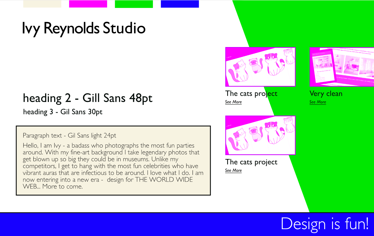
It may seem like a subtle shift but I wasn’t considering how the colors were going to be used. Before, I just had these “paint chips”. But those blocks of color were never going to be displayed that way. I also made the realization that my design felt a little bit like a comic book which was so true but NOT MY INTENTION AT ALL.
Derek talked it out with me and got me to think about what I wanted to make happen with those colors and it was right then and there that I realized I had to stick to my original goal or I was going to get too confused! So again I looked at my words…BOLD, EDGY, OPINIONATED and that gave me the permission to arrange what you will see next which is my portal card.
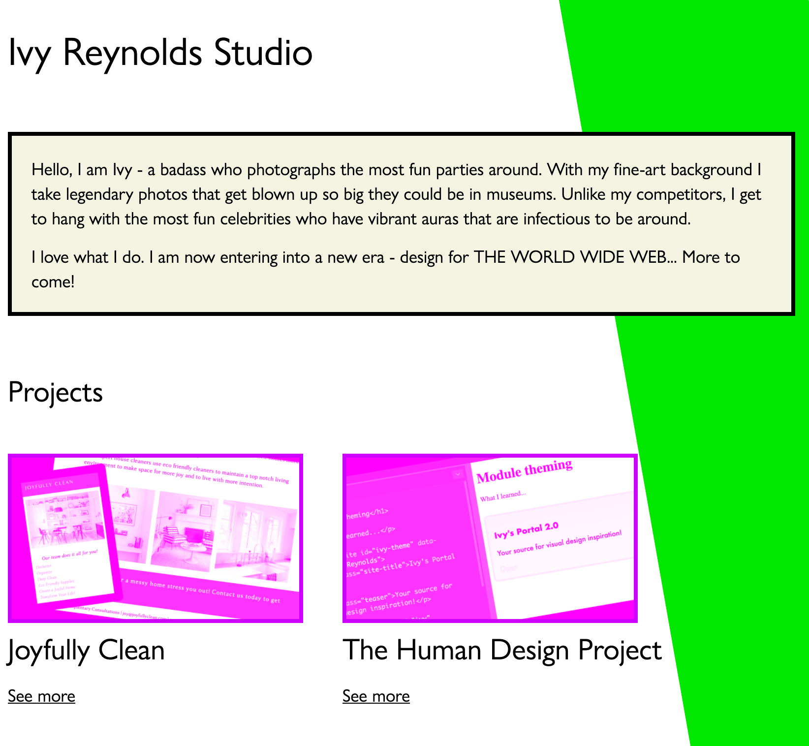
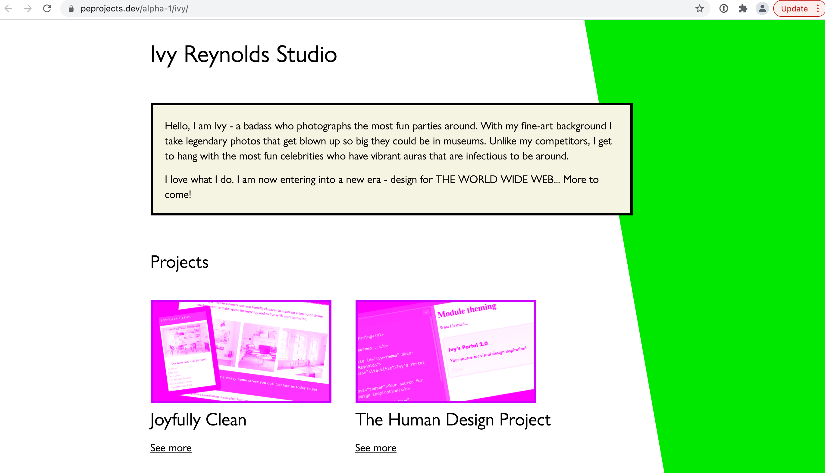
A “portal card” for the alpha-one alphanet!
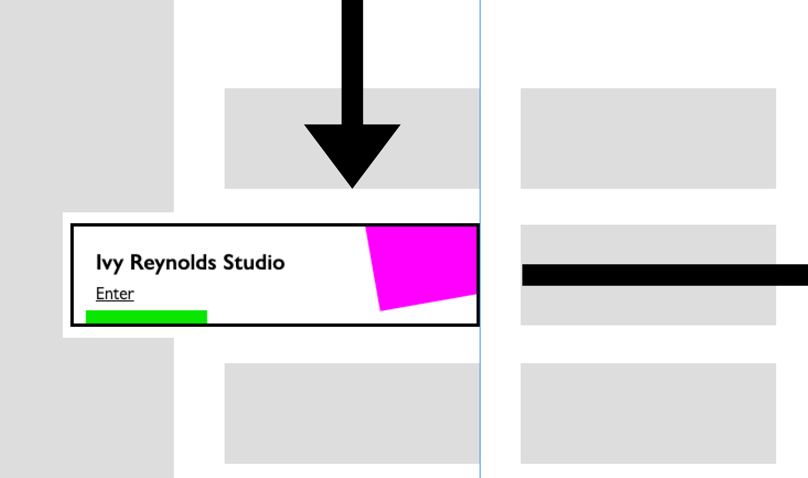
The portal card might not feel too earth shatteringly amazing but I felt like it looked cool! It felt fresh + clean and most importantly, inspired me to keep moving forward!
Next we worked out what this design might look like on a phone, tablet, and lastly - desktop. It was difficult to find a reason to add that green or blue color to the smaller screens. Were these designs getting me closer to hitting my goals?

Here is a fun overview of what this project looked like visually every step of the thinking process… I feel like you can really see a dead end here in my use of color but from here I started to code it and in that process I began to add in thoughtful layers of color.
Process

Every step of the way, I’m trying to keep the “visual language” clear and interesting. If you see my portal card, I want to give you a taste of what you’re in for and make you feel excited and invited.
Assets
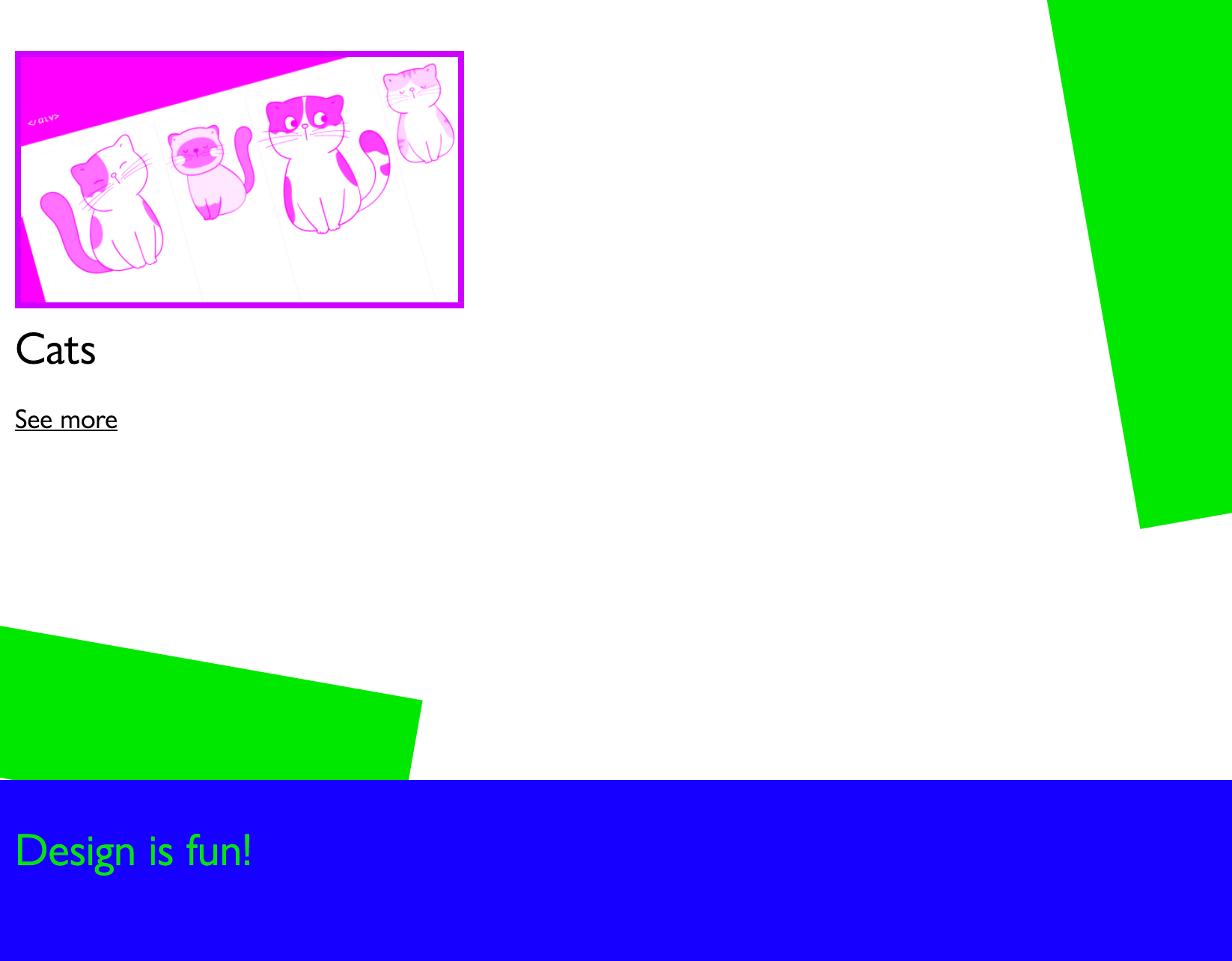
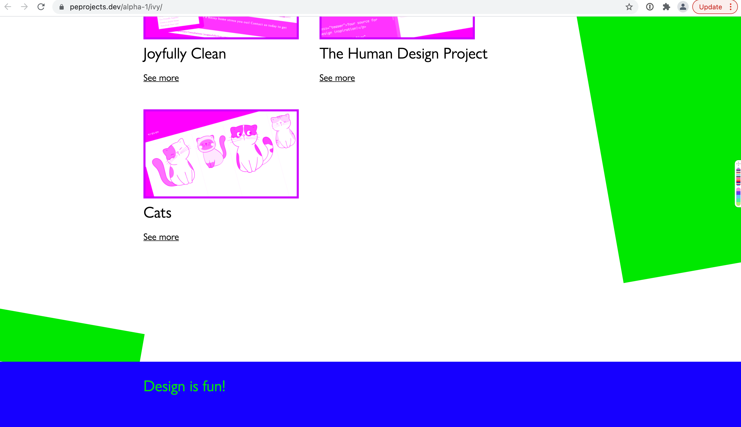
I created my little project thumbnails in Affinity designer and used the multiply filter to make them work with my pink color. I really loved how those turned out! It was fun trying to figure out a few visual tricks and reasons to use those colors!
Getting it into code
I used some custom property variable things for my color. Derek also showed me how to use absolute positioning to get those blocks of color where I wanted them. I also set up my phone so I could test with the local MAMP server. BTW, I also used PHP to list out the projects based on an associative array of data!
Issues:
The absolute positioning made the color blocks fall off the side of the screen. This was great… but then also - the browser on my phone would slide all around. The fact that they were “off” the screen - was ending up with scrollbars going side to side and that was not good.
By using `overflow-x: hidden` on both the HTML and BODY element, I was able to get those elements to “cut off” the shapes and makes sure that there was not overflow scrolling along that left-right axis? (I’m not totally sure how it works….)
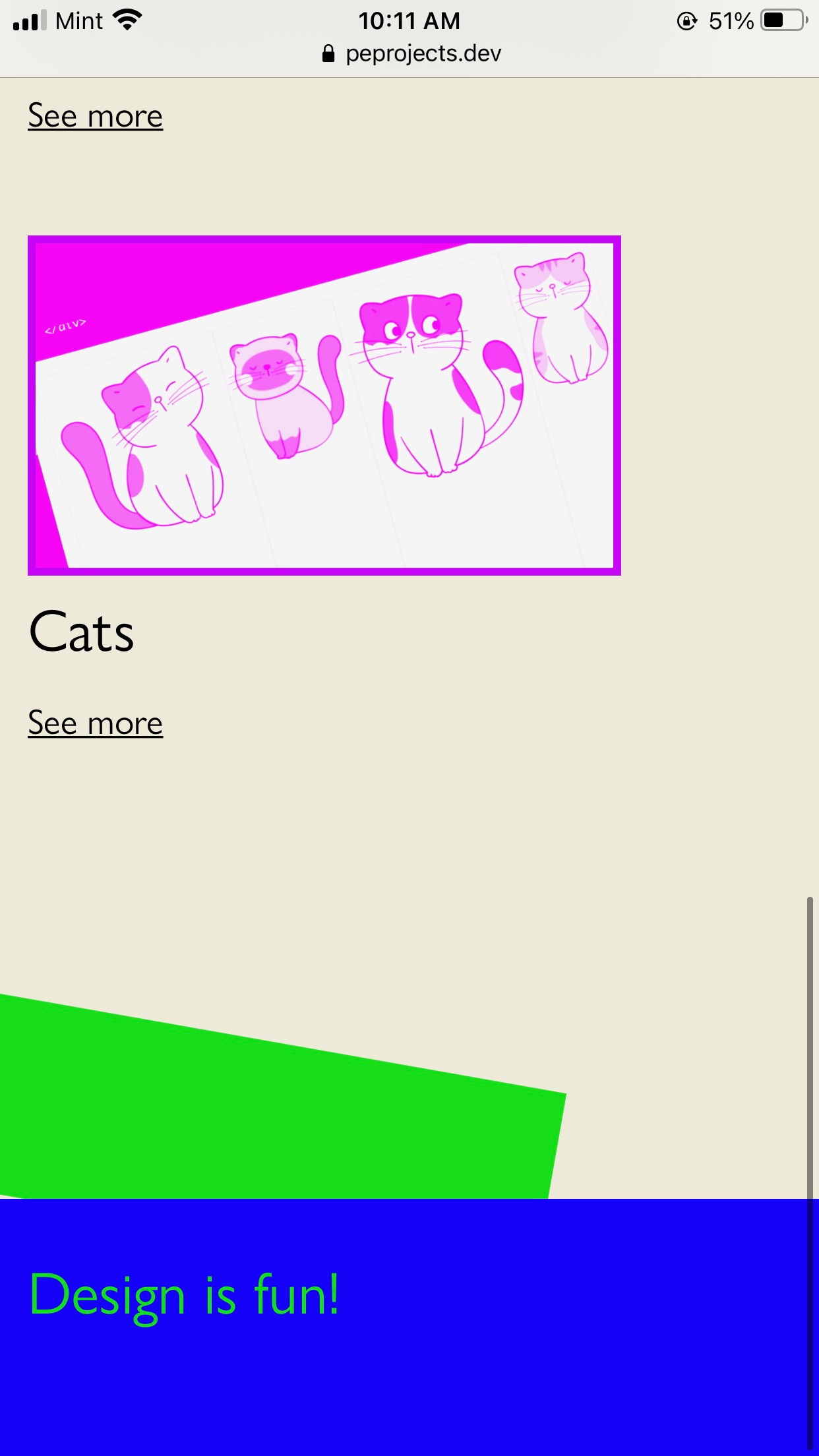
Final outcome
Here is where I am currently on phones…
Small screens


Medium screens
Large screens
Conclusion
Like I said I am pleased that I have come this far! It’s live now and looks intentional! I am pretty sure it’s meeting my current goals of 1. A webspace where people can find me + learn a little but about me. 2. Share projects! The links all work! YAY! 3. I think I may look fun to work with? 😀
But what is it that I do???
As you can see I have a lot more to consider and work through - I don’t really let people know what I can help them with - which is something I am actually still working out for myself! I also don’t have any contact information! UGH. Only noticing that right now!
Design is so much more than looking good - it’s also about creating something that people can actually use.
Something that is practical + looks cool is at the top of goals and something I will continuing to work on!
Until next time!
Ivy